Essential Tips to Optimize Your Site for Mobile Users
In today's digital landscape, mobile devices have become the primary tool for accessing the internet. As such, responsive website design has become essential to the success of any website.
Over half of global web traffic originates from mobile phones. So, businesses need to prioritize mobile optimization to deliver a seamless experience to their users. A few years ago, designers would design a website for PCs and then adapt it for mobile devices. Nowadays, best practise is to design initially for mobile devices and then adapt to PCs.
A website that performs well on mobile devices can increase user engagement, boost conversions, and improve search engine rankings. In this blog post, we’ll explore why responsive website design is critical and share essential strategies to ensure your site is optimized for mobile users.
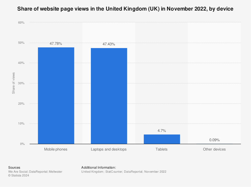
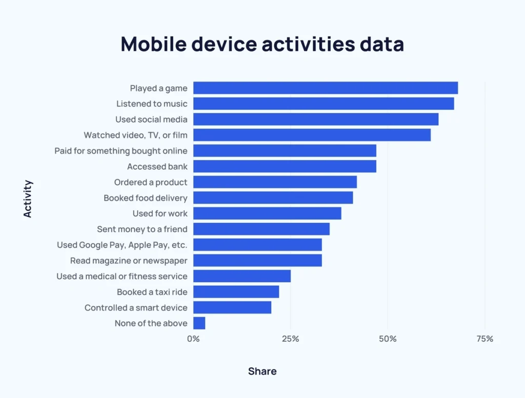
Today, mobile devices are used for entertainment, e-commerce, financial management, business meetings, and more.
Looking at the table below, it’s clear that mobile devices cannot be ignored by website designers and developers no matter what the subject of the website.
Why Responsive Website Design Matters
Mobile optimization is more than just a trend; it’s a business imperative. Here are some reasons why:
User Experience (UX): Mobile users expect quick, easy, and visually appealing access to information. A website that isn’t optimized for mobile may frustrate users with slow loading times, awkward navigation, or unreadable text, leading to higher bounce rates.
SEO Benefits: Google uses mobile-first indexing, meaning it primarily evaluates the mobile version of a site when determining its ranking. A mobile-optimized website can boost your visibility on search engine results pages (SERPs).
Increased Conversions: For e-commerce or service-based websites, a seamless mobile experience can directly impact conversion rates. Mobile-friendly design makes it easy for users to complete actions like purchasing or signing up, leading to more sales and sign-ups.
The Role of Responsive Website Design in Mobile Optimization
Responsive web design ensures your site’s layout adapts to different screen sizes and orientations. Instead of creating separate versions of your website for mobile and desktop, responsive design automatically adjusts elements such as images, text, and navigation to fit various screen dimensions.
Benefits of responsive design include:
Consistency: Your site will look and function well on any device, offering a cohesive brand experience.
Cost-Effectiveness: Maintaining one responsive website is simpler and cheaper than developing and managing separate mobile and desktop versions.
Enhanced SEO: Google favors responsive sites since they provide a better user experience across devices, which can positively impact search rankings.
Key Strategies to Optimize Your Website for Mobile Users
To maximize your website’s effectiveness for mobile users, consider these critical steps:
Use a Mobile-Friendly Framework
Modern frameworks like Divi are designed with responsive grids that help in creating layouts that adapt fluidly to different screen sizes. These frameworks are especially useful for reducing development time and ensuring that your site’s structure adjusts well on all devices.
Prioritize Page Load Speed
Page load speed is crucial for mobile users, who are often on slower connections than desktop users. Here’s how to improve load times
Optimize Images: Use compressed images without sacrificing quality. Formats like WebP can help reduce image size.
Minimize JavaScript and CSS: Large JavaScript files can slow down mobile load times. Only load essential scripts and styles for mobile.
Enable Browser Caching and Compression: Using caching and Gzip compression can help reduce the time it takes for your website to load on mobile devices.
Design for Touch Navigation
One aspect of mobile device design that is often overlooked by designers is the fact that mobile users interact with websites using touch screens, so design with this in mind:
Ensure Buttons Are Thumb-Friendly: Buttons and tap targets should be at least 44x44 pixels for ease of access.
Use Simple Navigation Menus: A “hamburger” or collapsible menu can help keep navigation organized without taking up too much screen space.
Avoid Pop-Ups and Intrusive Interstitials: Pop-ups can be frustrating on mobile devices. If necessary, ensure they’re easy to close and optimized for mobile screens.
Focus on Readability
Content readability is essential on mobile devices, where screens are smaller. Consider these adjustments:
Adjust Font Size: Use a font size of at least 16px to ensure readability without requiring users to zoom in.
Optimize Line Spacing: Too little spacing between lines can make reading difficult. Ensure there’s enough space for readability.
Limit Blocks of Text: Shorter paragraphs are easier to read on mobile. Consider using bullet points, numbered lists, or visuals to break up text.
Simplify Forms
Filling out forms on a mobile device can be challenging. Simplify your forms to improve user experience:
Reduce Required Fields: Only ask for essential information, making it quick and easy for users to complete forms.
Use Mobile-Friendly Input Types: For fields like email, phone number, or date, use input types that bring up the appropriate keyboard.
Enable Autofill and Progress Indicators: Autofill can save users time by automatically populating fields, while a progress indicator can motivate them to complete longer forms.
Example of Responsive Website Design - Swiss Air
This website is a good axample that illustrates Soome of the design strategies just mentioned.
The mobile version is free from clutter whilst retaining the important aspects of the PC version. It features large, clear buttons to facilitate touch operation
Swiss Air - PC

Swiss Air - Mobile

Other Responsive Website Design Strategies
Test Across Multiple Devices
Testing is essential to ensure a consistent experience for all users. Use tools like Google’s Mobile-Friendly Test, or cross-browser testing tools such as BrowserStack to check your website on various devices and browsers.
Implement Accelerated Mobile Pages (AMP)
AMP is a Google-backed project that creates lightweight versions of web pages, optimized specifically for mobile. These pages load almost instantly, providing an excellent user experience and potentially improving your site’s search rankings.
Final Thoughts
Mobile optimization is not a one-time task but an ongoing effort to ensure your website performs well as technology and user preferences evolve. By focusing on responsive design, speed, readability, and ease of navigation, businesses can create a seamless mobile experience that drives engagement and conversions.
As mobile usage continues to rise, prioritizing mobile optimization will become even more essential to maintaining a competitive edge and ensuring your users stay connected with your brand, wherever they go.